Problem
When you are developing a responsive web application there is always a need to test it on your mobile device. Although such browsers as Chrome, Firefox and Safari allow developers to try different screen sizes in developer tools, this is not always an accurate representation of how the application will look on a real mobile device. Up until yesterday, I would deploy the whole app to the Internet and then open it using the link on my phone just to check the UI. Sounds too complicated, right?
Solution
Yesterday I learned that there is a much simpler way - you can access your localhost using the address and the port provided your computer and your mobile device are connected to the same network.
Steps
Step 1:
Find the IP address of your localhost. There are two ways to do it:
Option A:
In your terminal type
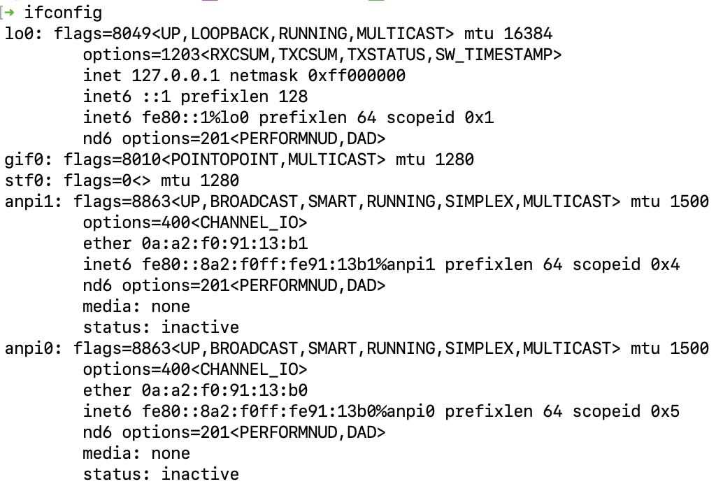
ipconfigfor Windows orifconfigfor Mac and Linux.You will see a bunch of interfaces in your network.
The output should look like this:

In most cases, the IP you are looking for should will start with
192.Option B:
Go to the network setting on your computer, and select the wi-fi tab in the menu. You should see the name of the network and the IP of your computer.
Step 2:
After you found the IP of your computer, type it in the browser, add a column and then the number of the port your application is running at. For React applications built with create-react-app the default port is 3000. You should get something like this: http://192.168.0.107:3000
Step 3:
If you type this numeric address in the browser of your mobile device - you will get access to the same application running on your computer.
And that was it!

